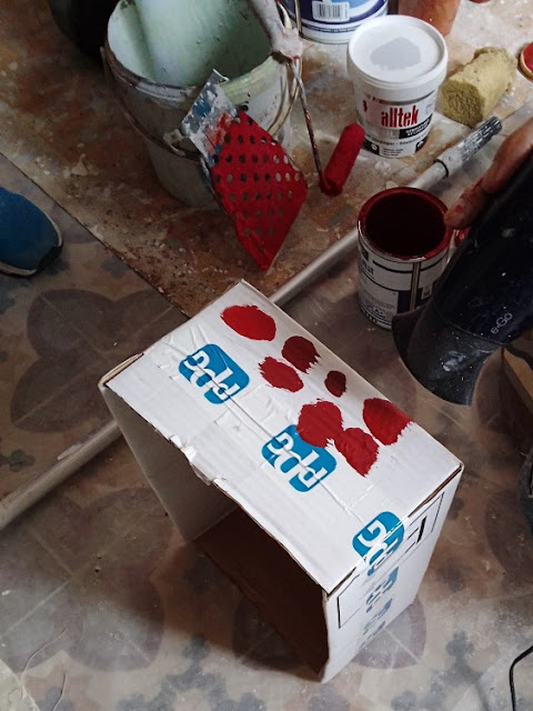
I chose the colours of our paint very carefully, especially the colour of the second (after the pierre apparentes) feature wall in the salon. Over the course of a couple of days I studied the colour swatches, compared them to the tiles, took spot colour samples from photos and ran them through colour matching programs, found the HEX value, matched that through encycolorpedia.com and came up with the paint reference number and name.
Except when paint met wall it was pretty obvious that the choice wasn't perfect. It was worryingly raspberry coloured, not the dark red edging towards brown that were we're hoping would match to the tiles.
It's a colour I like to think of as "old velvet curtain red". It works really nicely with artificial light, as well.


1 comment:
When I saw that first picture I thought "Never, they haven't.... surely!??" and I was very glad that it wasn't! It just isn't "you two"!
Your hard work paid off, the ochre'd colour is really nice!!
And yes, Old Velvet Curtain Red" sums it up..... nice and warming, too!
Post a Comment