What a disappointment!!
I was already familiar with St Pancras in its old, under-used guise as an extension of King's Cross station, and I had been shown around the adjoining Grand Midland Hotel some years ago, to see its abandoned Gothick splendours and catch a glimpse of a by-gone age of travel.
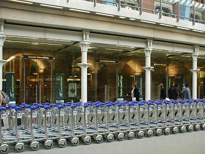
Revisiting, I expected to see sensitive and clever re-use of a marvellous and decoratively splendid space. What I saw was plate glass and polished steel, chopping up my sight lines in all directions. Everything, from the jumble of goods in the array of high street shops (chain stores), to the new bronze statuary, had to be viewed at least partly through the plate glass which was being used to divide up the space into different functionalities.
 [rant]Architects**! -- plate glass is not invisible! It has edges and fittings and reflections upon reflections. If there is a large feature statue, one needs to be able to stand some distance away from it and look at it through open space (even if it is of dubious artistic quality) -- NOT only be able to see it through one or more layers of plate glass or have to stand so close to it you are looking up the subjects' noses! Slotting shops into arched colonnades and fronting them with plate glass does not allow me to experience the full expanse of a magnificent architectural space -- it merely allows me to see the haphazard arrangement of commercially available goods that I could see in any shopping street in Britain! Please remember that the occupants of your architectural space will put randomly placed objects in your building with no regard for colour or proportion, they will stack cardboard boxes against your glass and they will respond instinctively to the real look of the place, not your fantasy on paper. Think about Stansted Airport and the difference between Sir Norman's empty hangar and the real thing in use today***, teaming with people and luggage, with the clean lines of the check-in desks cluttered with corporate branding from a dozen or more airlines and scuffed and chipped by relentless use. Did no one say to you at the start of the job -- 'Look, your mates ruined the Royal Exchange, but you have a chance to redeem yourselves here -- do something clever that will make peoples' hearts sing, not sink'.[/rant]
 And while we are on the subject of sinking -- the statue of Betjeman is quite sweet, and you can at least get an unimpeded view of it, but what's with all the nautical references in the quotations from his poems? Surely the man wrote enough about train travel? -- there must have been something that could have been used that wouldn't have mystified travellers, even when those not familiar with his work are presented with a single line with no context to help make sense of it.
Susan
*Turns out to be rather 'much hyped'.
**That's architects of this ilk, not the architects I know are out there and understand how to set an old building up for modern use. I am also well aware that once the designer hands the project over to the men with the chequebooks, they often no longer have any influence.
***The caption on this picture, which I got from e-architect, says 'Concourse once airy and calm is overflowing with people and shops'.


3 comments:
Yes Susan, these "improvements"are akin to a stream of abuse ,taken in by the eyes not the ears, but just as unsettling.
Nice rant! So is what's become of the old Eurostar terminus at Waterloo?
Mothballed, so far as I know.
Post a Comment